01 — Brand Identity
Shem
Interiors
- Project
- Shem Interiors
- Discipline
- Brand Identity / Logo Design
- Studio
- Interior design, led by Shai
IDENTITY ON DISPLAY
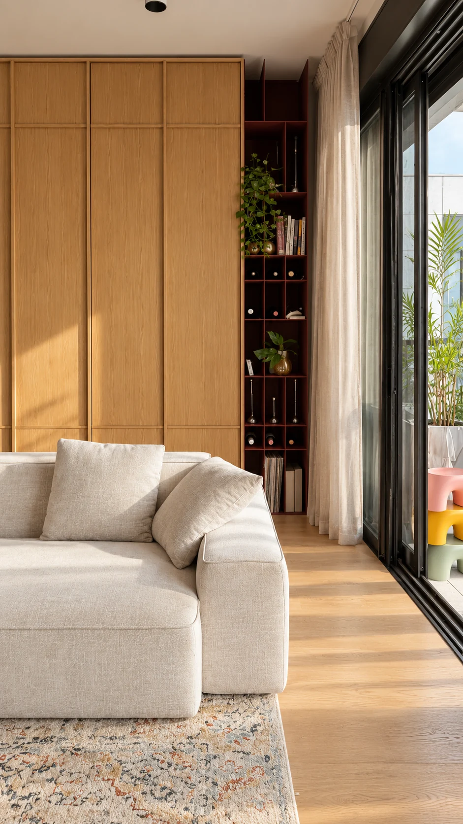
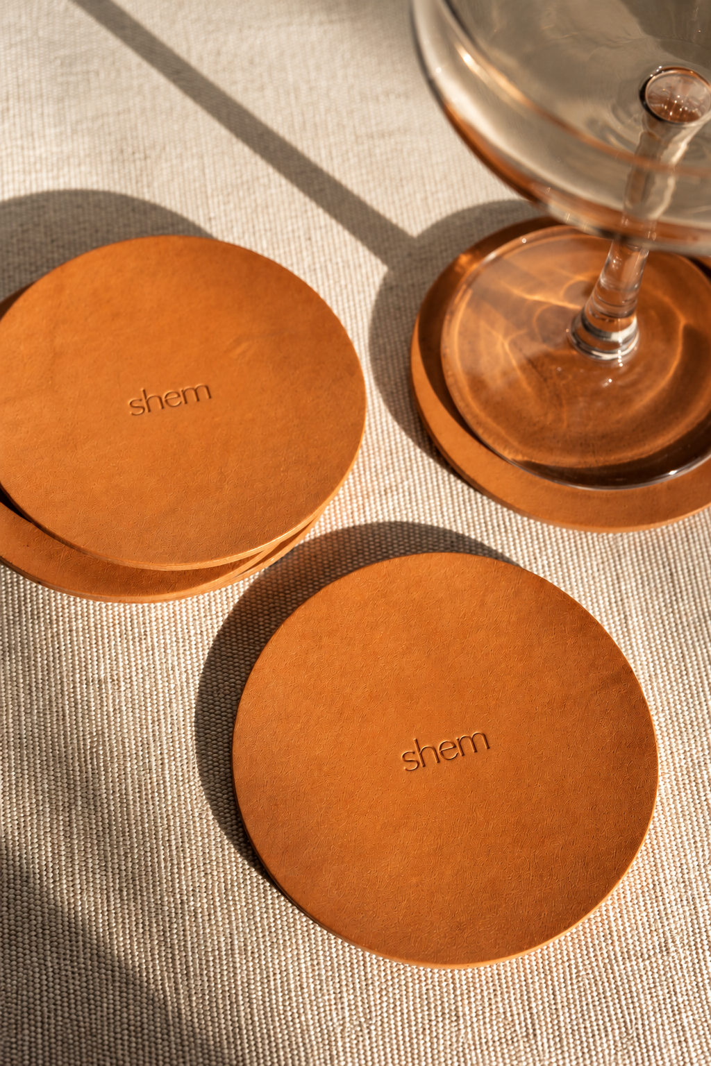
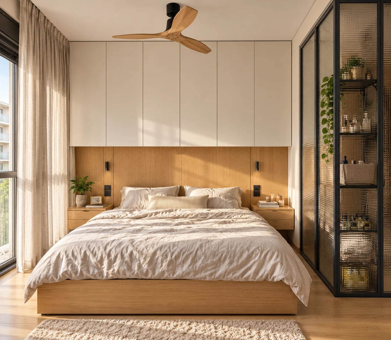
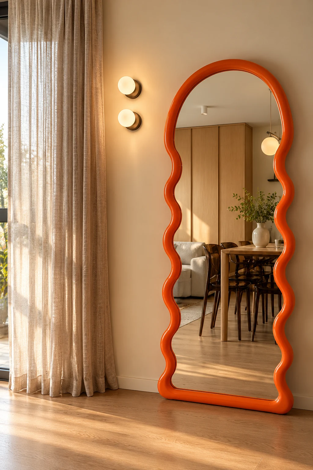
Shem Interiors approaches each home as a personal expression of the people who live in it. Guided by a refined yet welcoming aesthetic, the studio balances clean design with character and individuality.
As a newly established interior design studio, Shem needed an identity that could communicate confidence, sophistication, and a distinct point of view from day one. The challenge was to create a visual presence that felt established.
You Name It

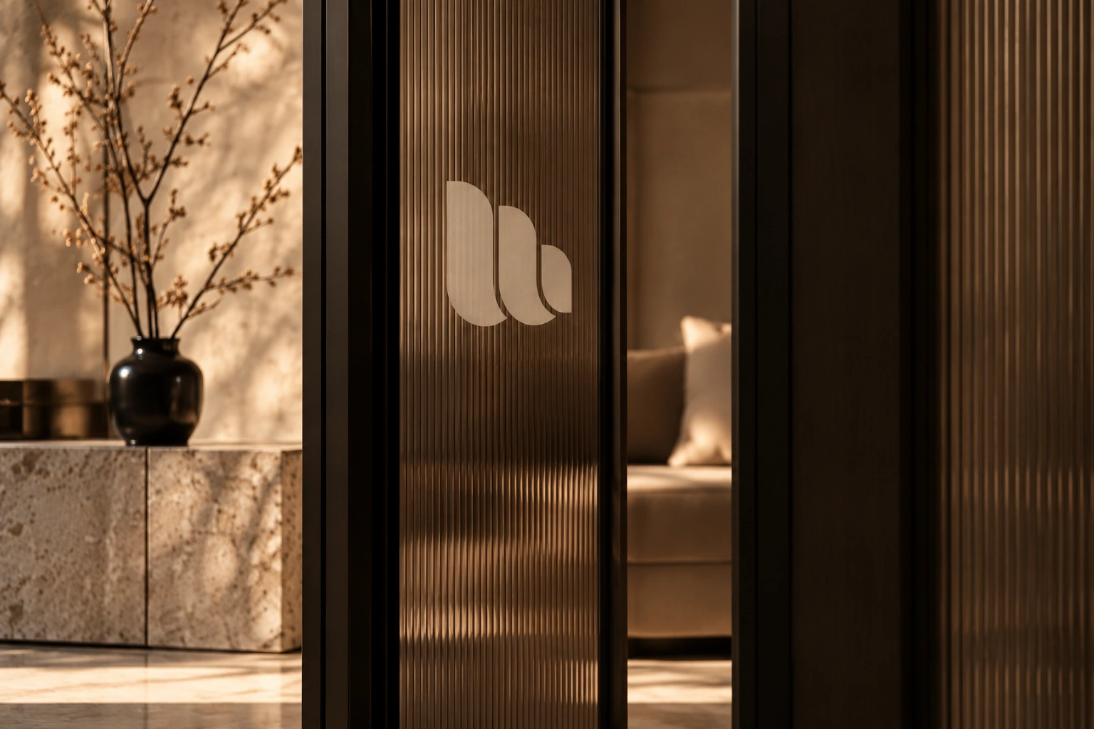
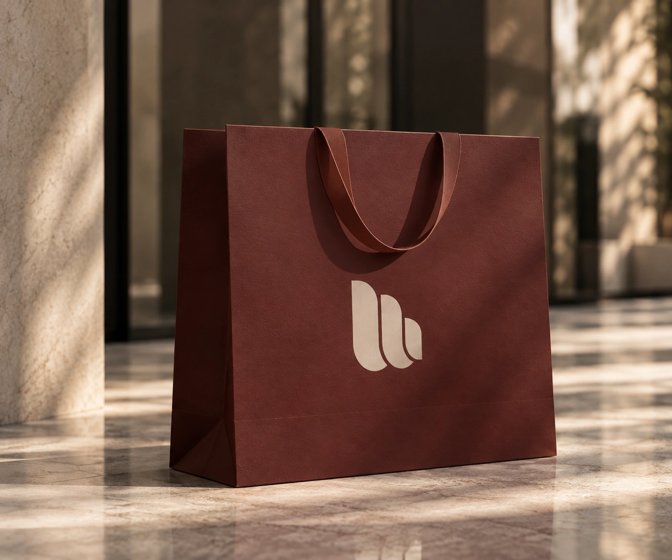
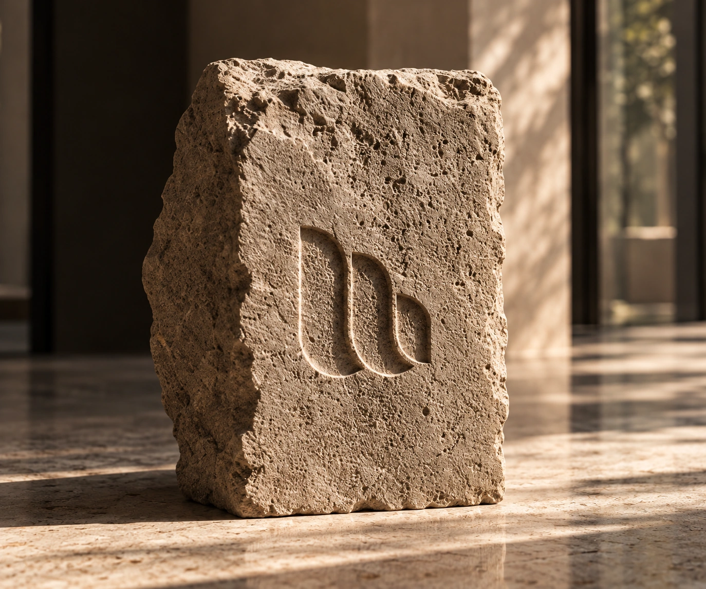
Inspired by biblical Hebrew calligraphy, the symbol draws on the letter Shin to reflect the studio's connection to Jewish heritage and the spiritual significance of home. Its structured proportions and softened curves bring together architectural precision and a gentle, feminine sensibility.
Soft curves, quiet type.
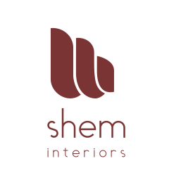

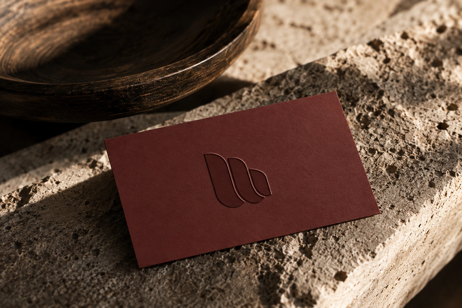
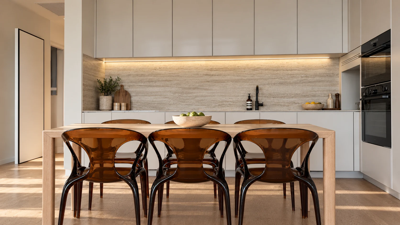
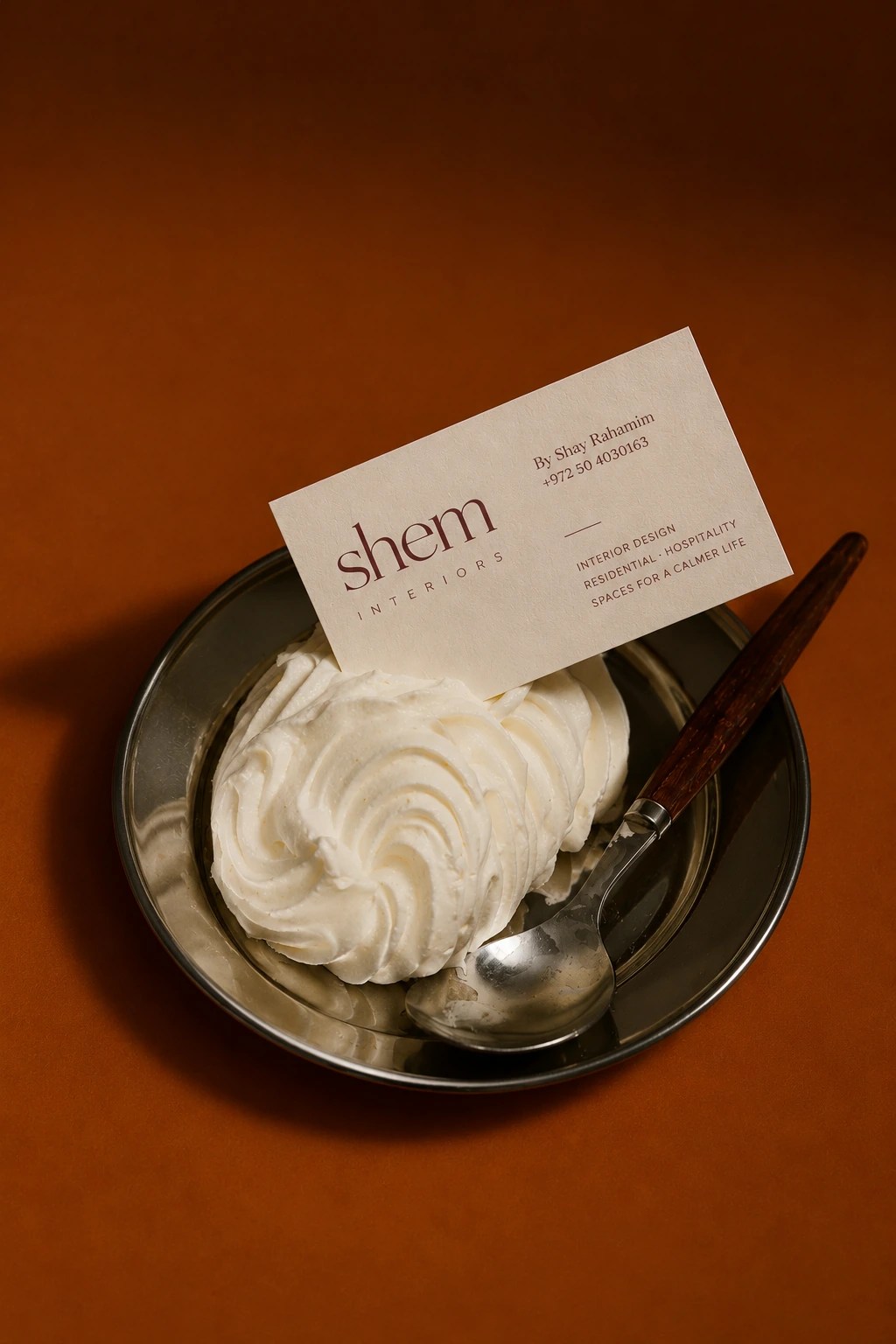
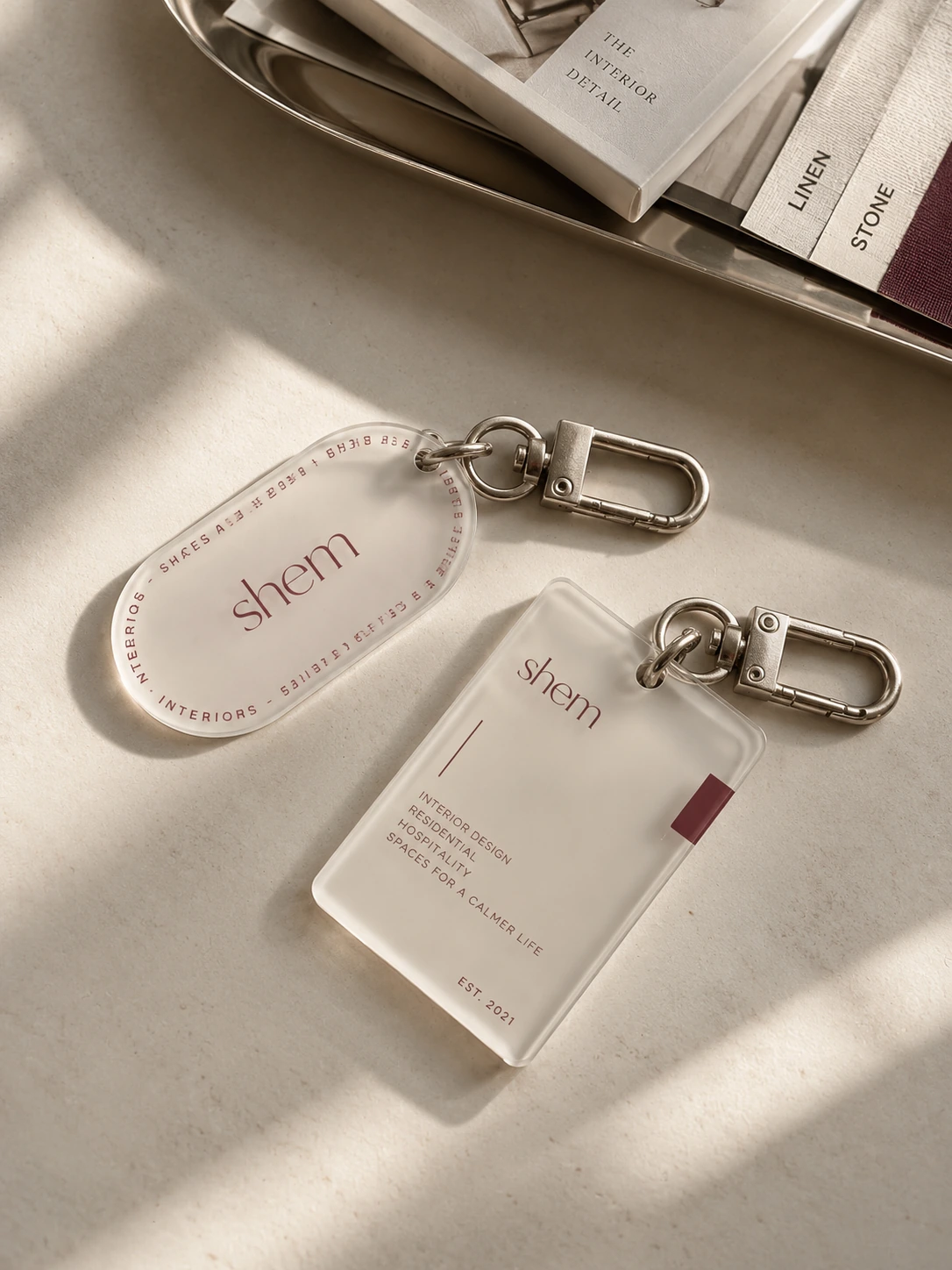
Burgundy was a clear preference from the client. I refined the shade to feel less trend-driven and more enduring, pairing it with stone-inspired neutrals that complement the travertine surfaces central to the studio's aesthetic.
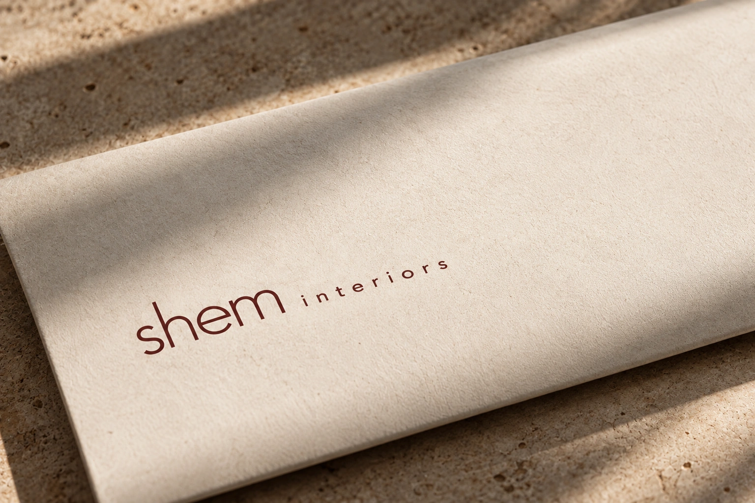
The wordmark stays open and understated, allowing the symbol to carry the identity's distinctive character.
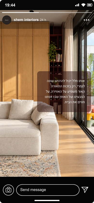
על בתים ואנשים.
אנחנו מאמינות שבית הוא הרבה מעבר לחלל. הוא המקום שבו חומר, אור וזיכרונות נפגשים, ויוצרים תחושת שייכות שאין לה תחליף. כל פרט נבחר מתוך מחשבה, כדי ליצור מרחב שמרגיש אישי, טבעי ונכון למי שחי בו.
לכל אדם יש הרגלים, העדפות ואופן אחר לחיות בבית. לכן אין דרך אחת נכונה לעצב חלל. יש מי שאוהב מינימליזם ושקט, ויש מי שמעדיף צבע, שכבות ואופי. העבודה המשותפת היא למצוא את האיזון בין מה שאוהבים, מה שצריכים ומה שמרגיש נכון ביום־יום.
A Matter of Type
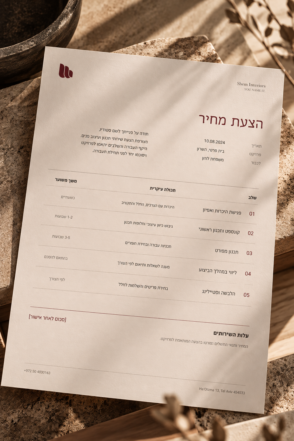
Bellefair gives headlines an expressive, characterful voice in both languages, while Heebo keeps body text and supporting information clear and restrained.
Shem Interiors
בין חומר לרוח.
Thoughtful spaces, shaped around the people who live in them.
חללים אישיים, מדויקים ונעימים לחיים.
Reflection
Working on Shem reminded me that a strong identity doesn't need to be complicated. The challenge was to give a new studio a recognizable visual language without letting the branding overpower the work itself. Looking back, what I value most is the balance between a distinctive symbol and a system that leaves room for the studio's projects to speak for themselves.